Where is the best place to add a buy button in my Shopify store?
The “BUY IT NOW” button or the “ADD TO CART” button is as important to your Shopify store as the chain to your bicycle. Without it, you won’t be able to go anywhere no matter how hard you paddle.
Some live website example for best place to add buy button
The same is true for the “buy” button on your store. That’s why its placement shouldn’t be guesswork. Let’s have a look at the buy buttons of some of the most successful stores.
Raycon
Raycon is an electronics store built with Shopify. They have decided to place an orange “ADD TO CART” button with the same width as the content column.
Megan Marrs, in her article on CTA button best practices, says that orange is one of the most conversion-friendly colors. Green is in the same league as well.
Have a look at their buy button below.
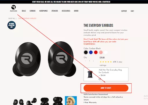
It’s in the above-the-fold of the product page. And very visible. Its size makes it very easy to click too.
In mobile devices, the cart button is below the fold. You have to scroll a little to reach it. Because of its size, it’s very easy to tap on with your thumb.
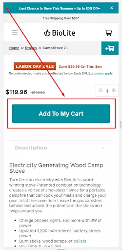
BioLite
BioLite sells camping equipment. On their desktop pages, they have placed 2 ATC buttons on their page. One is a sticky one just above the product page header. The other is at the bottom of the above-the-fold.

Both are highly visible and easy to click which are crucial to getting more visitors to click on your cart buttons.
The mobile view
The add-to-cart button of BioLite in the mobile version is visible. However, it’s not easy to reach using your thumb. Visitors will need to move their index finger or thumb to tap on it.
Upon scroll, it disappears out of the viewing window which is not good for conversion.
RUGGABLE
After browsing through electronics and camping equipment stores, I needed a break. And just then I came across RUGGABLE. As it’s clear from its name, they sell rugs.
Their add to cart button is just one tiny scroll below. Even though it is easy to notice because of its yellow color, it’s not as easy to access as that of BioLite. The fact that it’s not sticky makes it more difficult for visitors to click.
Have a look at the mobile view of the RUGGABLE product page.
They have placed it at the bottom of the screen which is an ideal place. Its screen-wide size makes it even more tappable. What confused me a little is the other ADD TO CART button which appears upon scroll.
The two cart buttons had me a little confused. Which one should I tap to buy it? In my opinion, they should remove the sticky one. Instead, the one on the page should stay sticky at the bottom of the screen after it just appears.
Negative Underwear
Negative Underwear, like the other brands I have covered, has chosen the mid-section of above-the-fold for their cart buttons.

However, they have tried to be creative just like they did with their brand name. See it in action below. Mobile view of Not-so-positive Underwear
I was feeling kinda creative as well. Here is their product page on smartphones.
The interactivity of the cart button from its desktop version is present on phone and tablet versions as well. Even though it gets in the way of conversion, it helps people experience their creativity first-hand.
Handpick article for more: How to animate Shopify add to cart button easily? (Free method)
Taylor Stitch
What does Taylor Stitch sell? Clothing items. They have made it to the most successful Shopify store lists curated by Oberlo and some other notable brands.
They have placed their cart button in the above-the-fold part of their product pages.

Did you notice the width of the button? Like Raycon, it’s as wide as the header. And because of its placement, it’s easy to click as well.
When I open this page from Taylor Stitch on my smartphone, the add to cart button is not anywhere on the first screen. You have to scroll once to find it.
As I have mentioned several times, this practice doesn’t actually help get more sales.
In this respect, Taylor Stitch took the same road as Negative Underwear. They want people to see their scroll and see more of their page.
For some brands, this practice has boosted the time-on-page I.e., made people stay a little longer on their page. Products that need more decision-time should follow this.
So, where should I place the BUY button on my Shopify store?
For the desktop version of your store, above-the-fold region. As you now know, this place receives the maximum user attention.
For phones and tablets, the add-to-cart should be sticky and near the bottom of the screen.
Gymshark has done it really well.

It’s sticky, has a high-contrast color, is about the same width as the screen, and looks like a button. The perfect recipe for your “ADD TO CART” button.
So that’s it.
I have tried to offer you a practical answer to your “buy button placement” question based on actual stores.
Have more questions?
Some related article help you to do more: How to Add Pre Order Button in Shopify
Feel free to put it in the comments below. I answer each and every one of them.


